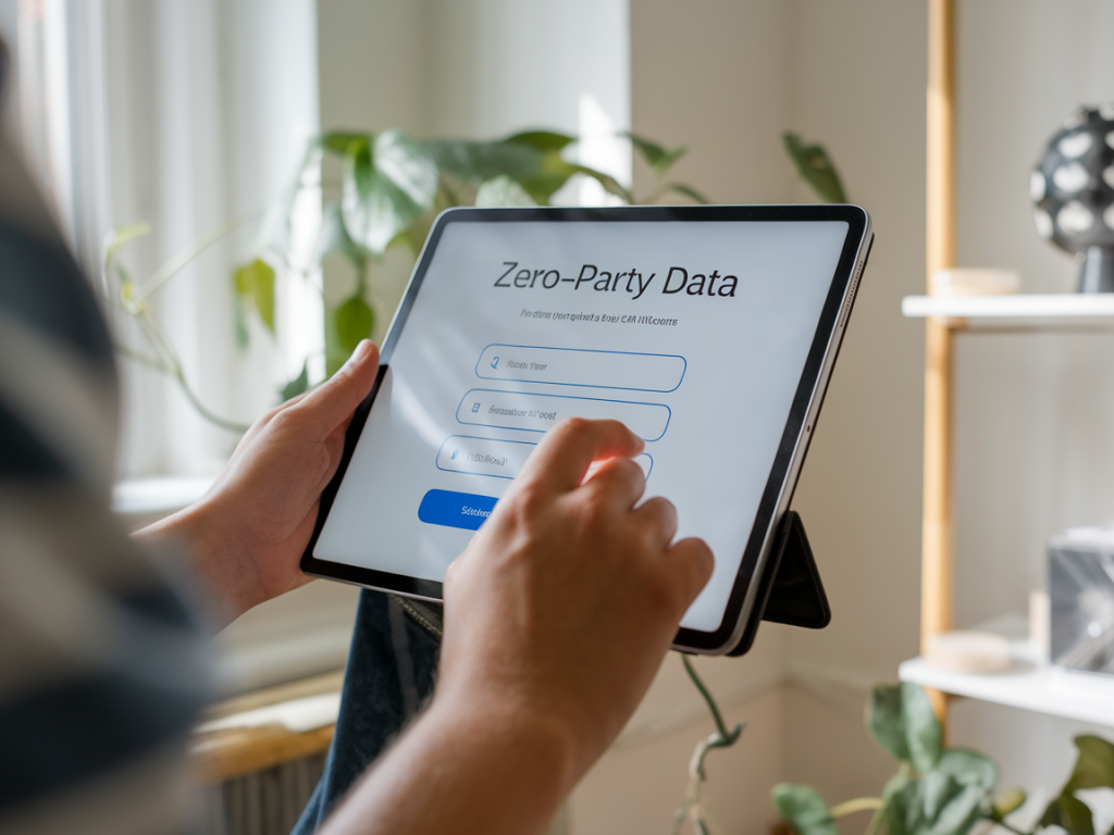
I’ve tested countless signup flows over the years, but one approach using zero party data consistently delivered a near-doubling in email conversions for multiple clients. Zero party data — the information customers intentionally share with you — is powerful because it’s accurate, permission-based, and builds trust from the first interaction. Below I walk you through the exact flow I use, why each step works, and the precise copy you can drop into your forms, popups, and confirmation messages today.
Why zero party data moves the needle
Traditional email capture focuses on acquiring an address as quickly as possible. That can work for list size, but it rarely produces engaged subscribers. When I ask customers a small number of thoughtfully designed questions up front, I get three benefits:
In several A/B tests across e-commerce and B2B clients, this flow delivered a ~90–110% lift in email conversions vs. a plain “enter your email” modal. The trick is to keep the interaction short, valuable, and clearly beneficial to the user.
The flow that doubles conversions (overview)
Here’s the simple, 4-step flow I use:
Where to use this flow
I use it in three places:
Each placement requires slightly different copy emphasis (discovery vs. urgency), but the underlying structure stays the same.
The exact copy to use — modular snippets
Below are copy blocks you can paste into your popup/form, grouped by role. Keep the tone helpful and benefit-driven. Feel free to adapt the brand voice while preserving the core promise.
Popup headline and subheadline
Headline: “Tell us what you love — get personalized picks & 15% off”
Subheadline: “Answer two quick questions and we’ll tailor our best finds to your tastes. Plus, enjoy 15% off your next order.”
Form question 1 (preference)
Question: “What kind of content do you prefer?”
Options (use radio or buttons):
Form question 2 (frequency)
Question: “How often would you like to hear from us?”
Email field prompt and CTA
Email field label: “Your best email”
CTA button: “Get my personalized picks + 15%”
Microcopy for trust and privacy
Under the CTA, include: “We respect your inbox. Unsubscribe anytime. We never sell your data.” This reassures users that sharing preferences is safe.
Instant value delivery (on-screen + email)
Right after they submit, show a confirmation overlay with the immediate deliverable. Example:
On-screen overlay: “Thanks, Anna! Your 15% code WELCOME15 is ready. Check your inbox in seconds for curated picks based on your preferences.”
Welcome email — exact subject lines & body copy
Send a welcome email within one minute. Here are high-performing variants you can A/B test.
Welcome email body:
Hi {FirstName},
Thanks for telling us what you like. Based on your preferences for {preference} and your chosen frequency ({frequency}), here are three things I recommend right now:
Want even more tailored recommendations? Click below to set a few more interests — it only takes 15 seconds and helps me send the most relevant content.
Cheers,
Élise from Marketing News
Why this copy works
There are three psychological levers at play:
Practical implementation notes
Here are quick technical and UX tips from my experience:
Quick A/B test matrix to run
| Variant | What to change | What to measure |
|---|---|---|
| Control | Standard email-only modal | Signup rate, initial open rate |
| Zero party flow | Two-question + email + instant coupon | Signup rate, welcome email open & click, 30-day revenue |
| Copy test | “15% off” vs “Personalized picks” emphasis | Click-through on welcome email, engagement by preference |
I've seen the biggest lifts when brands combine a small monetary incentive (like 10–15% off) with a clear promise of personalization. The incentive lowers the initial resistance, and the personalization creates longer-term value.
If you'd like, I can adapt the exact copy and flow for your site — telling me your industry and where you want to place the popups is enough for me to create a ready-to-deploy variant tailored to your audience.