I run a lot of creative tests before I let a TikTok ad campaign loose. Over the years I’ve learned that a viral-looking video isn’t enough — you need predictable signals that tell you whether a creative will perform once it’s scaled. I want to share a practical, six-step pre-launch test I use to predict ad performance on TikTok. It’s simple, repeatable, and it saves budget (and headaches).
Why pre-launch testing matters on TikTok
TikTok’s algorithm rewards engagement, relevance, and rapid watch time — but those metrics can mislead if you only look at them after launch. I’ve seen beautifully shot ads that flopped because they didn’t match audience intent, and raw UGC-style videos that exploded because they hit a cultural note.
Pre-launch testing reduces risk. It helps you spot problems early: weak hooks, confusing messaging, inefficiencies in the funnel, or creative elements that distract rather than convert. The six-step framework I use focuses on both creative craft and early performance indicators to make a go/no-go decision before you spend a lot on scaling.
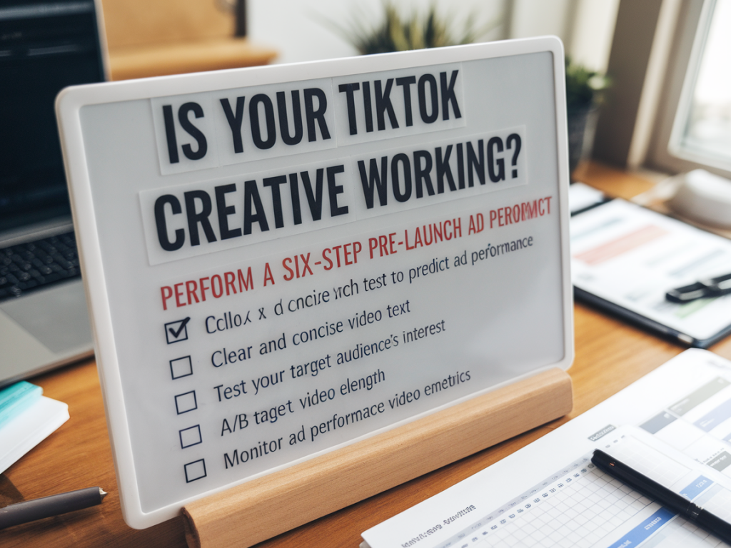
The six-step pre-launch test
- Hook & retention check
- Message clarity score
- Audience micro-validate
- Sound and branding compatibility
- Call-to-action (CTA) friction test
- Mini-spend predictive test
Hook & retention check
First impressions on TikTok are everything. I watch the first 3 seconds of my creative on repeat and ask: does it immediately tell the viewer why they should keep watching? The hook can be visual (an unexpected image, movement), verbal (a bold statement), or situational (relatable moment). If I can’t articulate the hook in one sentence, it needs revision.
Then I run a quick internal retention test: I show the video to five people — teammates, friends, or even followers — and ask them to hit “stop” as soon as the video loses their attention. I time their watches and record the average retention. For TikTok, a strong creative should hold attention for at least 50–60% of the video length in these informal tests.
Message clarity score
Next, I evaluate whether the creative communicates the single most important message clearly and quickly. Is the product benefit obvious? Can someone explain what’s being offered in one sentence? To quantify this, I use a simple scoring method:
| Question | Score (0–2) |
|---|---|
| Is the product/service shown clearly? | 0 = no, 1 = somewhat, 2 = yes |
| Is the main benefit obvious within 5 seconds? | 0 = no, 1 = unclear, 2 = crystal clear |
| Is the desired action clear (shop, learn, sign up)? | 0 = no, 1 = ambiguous, 2 = explicit |
I aim for a total of 5–6 out of 6. If the creative scores below 4, I rework the message until it’s clearer.
Audience micro-validate
Not every creative works for every audience. I run a micro-validation by testing the creative with 2–3 narrow audience slices using paid traffic at a tiny scale. Think £20–£50 per slice for 48 hours. Targeting could be interest-based segments or lookalikes. The idea is to see relative performance: which audience yields higher view-through-rate (VTR), click-through-rate (CTR), and early conversion signals (adds to cart, signups).
Compare the audiences and note where engagement is strongest. Sometimes the creative will shine with a surprisingly specific niche — maybe people interested in small business accounting, or vegans, or runners. That insight is gold for scaling later.
Sound and branding compatibility
Sound is a secret superpower on TikTok. The right track can boost watch time, but a mismatch can feel inauthentic. I test several audio options: the original native sound, a trending track, and a muted/subtitle-first version. For each, I observe watch time and comments from the micro-test. If the trending track drives higher retention but distracts from the message, I prioritize message clarity — unless the trend itself becomes the message.
I also check brand presence: is the brand too prominent too early? Over-branding in the first 2–3 seconds can reduce curiosity. I prefer subtle branding until the value is established, then reinforce with a quick logo shot or on-screen text near the end.
Call-to-action (CTA) friction test
A brilliant creative that fails to convert typically has a CTA problem. I run a simple friction audit:
- Is the CTA visible and understandable within 2–3 seconds after the value is communicated?
- Does the CTA require a complex action (install app, create account) that you can’t justify in one short video?
- Is there a clear, low-friction entry point (learn more, shop now, swipe up)?
If I suspect friction, I prototype a lower-barrier CTA — for example, “Learn how in 30 seconds” or “Tap to see pricing” — and re-test. Often reducing friction by one step doubles conversion rate in early tests.
Mini-spend predictive test
This is where we get quantitative. I set a tiny campaign (£100–£200 total) with the creative and the best audience from the micro-validate step. The goal is not to scale, it’s to get predictive signals within 72 hours. I optimize for link clicks or view-through-rate depending on the objective. Key metrics I watch are:
- VTR (3s/6s/Full) — higher VTR generally correlates with lower CPMs and better ad delivery.
- CTR — indicates curiosity and intent.
- CPR (cost per result) relative to a benchmark for your product (CPA target).
- Comment sentiment — are people asking useful questions or leaving negative feedback?
If VTR is above your historical median and CTR is at least 0.2–0.5% (benchmarks vary by vertical), the creative passes. If CPR is double your target, that’s a red flag unless you have high post-click conversion rates to justify the spend.
Putting the signals together
I weigh the qualitative and quantitative signals. A creative that scores well on hook, clarity, and CTA, and shows positive micro-spend metrics, gets a green light. If one or two areas are strong but another is weak (for example, great retention but poor CTR), I iterate on the weak point and re-test the mini-spend.
For clients like Shopify brands I’ve worked with, this approach often revealed that UGC-style testimonials outperformed polished explainer videos. For SaaS, the best creatives leaned into a clear problem statement and quick demo. These learnings guide not only creative decisions but also budget allocation during scale.
Finally, document everything. I keep a creative playbook that records what worked, for which audience, with which audio, and the exact spend used for the mini-test. Over time, this dataset becomes your fastest path to reliably predicting TikTok ad performance.