We pour so much time, energy, and budget into driving quality traffic to our websites. From SEO and paid search to social media campaigns and influencer partnerships—every click counts. And yet, too often, I see brands focusing solely on acquisition, while the real culprit of a stagnant conversion rate lies further down the journey: the checkout page.
Let’s get honest for a moment—as marketers, we’ve all been there. The numbers just aren’t adding up. You’re getting the clicks, your funnel seems solid, but conversions? Flat. When I’ve been called in to audit e-commerce performance, the one common thread in underperforming stores is often a neglected or overcomplicated checkout experience. So, let’s talk about that crucial final step.
Why It's Not Just About Traffic Anymore
I talk to so many business owners and marketers who assume that a low conversion rate must mean inefficient targeting or poor ad quality. While these are valid considerations, they’re only part of the equation. You might be driving the right audience to your site, but if your checkout process is slow, confusing, or lacking trust cues, you’re essentially inviting abandonment.
According to Baymard Institute, the average cart abandonment rate is a whopping 69.99%. That means nearly seven out of ten visitors who add a product to their cart never complete the purchase. And crucially, over 17% of those abandon because the checkout process was too long or complicated.
Signs Your Checkout Page Might Be Failing You
If your ecommerce sales have plateaued or dropped despite a steady (or increasing) flow of traffic, these are the red flags I usually look for:
- Too many steps: If your checkout has three or more pages, friction starts to creep in.
- Lack of trust indicators: Missing SSL certificates, no customer reviews, or unclear return policies can raise red flags.
- Limited payment options: If users can’t find their preferred payment method, they may walk away.
- Forced account creation: Requiring a login before checkout? Prepare to lose impulse buyers.
- Mobile unfriendliness: Over 60% of ecomm traffic is mobile—if your checkout isn’t responsive, it’s a deal-breaker.
My First Fix? Simplify the Flow
I once helped a mid-sized fashion retailer who had a five-page checkout process because they thought it gave them “more control.” What they got instead was a sky-high abandonment rate. The fix? We implemented a single-page checkout using Shopify’s native customization and introduced autofill for returning users.
That small change alone boosted conversions by 21% within the first month.
Remember, most customers don't want to "register"—they want to checkout and get on with their day. Platforms like Shopify, WooCommerce, and Magento now offer plugins that can help minimize friction. Klarna, Stripe, and Apple Pay also provide faster checkout options with built-in trust elements and verified payment flows.
Trust Is a Currency: Are You Earning It?
Would you hand over your credit card details on a sketchy-looking page with no security badge? I wouldn’t either. Yet so many checkout pages are treated as an afterthought—visually inconsistent with the rest of the site, riddled with generic messages, or outright confusing.
Here are some ways to visually and psychologically boost trust:
- Use SSL certification (display the lock icon)
- Show payment method logos (Visa, MasterCard, PayPal, etc.)
- Include customer service links or FAQs during checkout
- Display reviews or testimonials near the payment form
- Highlight payment guarantees or satisfaction policies
Personally, I like to A/B test adding small nudges like “Secure Checkout,” “Your information is safe with us,” or even trust badges from McAfee or Norton. These subtle cues reassure shoppers right when it matters most.
The Psychology of Urgency and Reassurance
I recently worked with a skincare brand that saw a 38% increase in sales after we tested a few psychological levers directly at checkout. What did we do? We added:
- A countdown timer for limited-time offers
- Inventory scarcity notes like “Only 3 left in stock”
- Real-time purchase pop-ups (“Sophie from Paris just bought this cream ????”)
These elements tap into FOMO and provide social proof. Combined, they create a sense of urgency while reassuring users that others are confidently buying from you too.
Should You Offer Guest Checkout? Always.
This one is non-negotiable in my book. I’ve lost count of how many times I’ve been in a rush buying something online, only to close the tab when I was forced to create an account. You need to let first-time users checkout as guests and then optionally invite them to register after the purchase is complete.
Most platforms allow you to capture an email first as part of guest checkout—good enough for follow-up marketing. Bonus points if you attach a discount code for registering post-purchase.
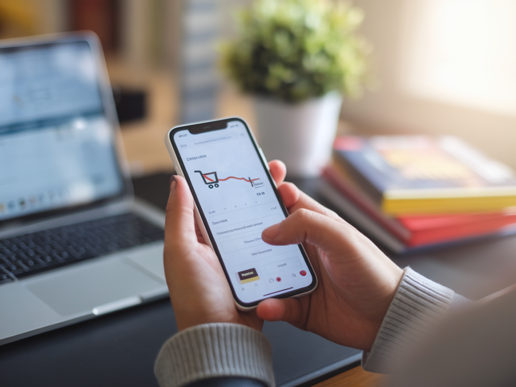
Speed Is Everything
Try this: go to your website's checkout from your phone. How long does it take to load? How many times do you have to scroll and tap? If it’s more than 2 seconds to load and more than 3 actions to complete purchase—you’ve got some serious optimization to do.
Use tools like Google PageSpeed Insights, GTmetrix, or even Shopify's built-in performance audits to assess your checkout flow. Lazy loading, compressing images, reducing popups at checkout—all these tweaks can yield impactful results.
Let Data Lead the Way
One strategy I swear by: Session recording tools like Hotjar or Crazy Egg. These don’t just show me analytics, they show me behavior. I can see where people hover, click, rage-click (yes, that’s a thing), or abandon their cart. Watching 10 real user sessions has taught me more than a month of spreadsheets ever could.
Pair this with analytics-based funnel tracking via Google Analytics 4 or Mixpanel, and you’ll get a clear view of exactly where drop-offs happen—even between micro-steps of the checkout sequence.
Bonus: The Magic of One-Click Checkout
If there’s one feature I’m seeing convert like crazy right now, it’s one-click checkout. Amazon pioneered it, and now tools like Fast, Shop Pay with Shopify, or Bolt are democratizing it for smaller retailers. Imagine if your customer could tap “Buy Now” and it’s done. That’s not only convenient—it’s loyalty in motion.
For brands dealing in repeat purchases—think supplements, pet food, or beauty—this is the next frontier. Faster checkout equals less cognitive load, fewer abandoned carts, and a smoother customer experience.
So the next time you're looking at your KPIs and getting frustrated with your conversion rate, don’t assume it’s your traffic. Scroll down to your checkout page—it might just be where the real story begins.